–
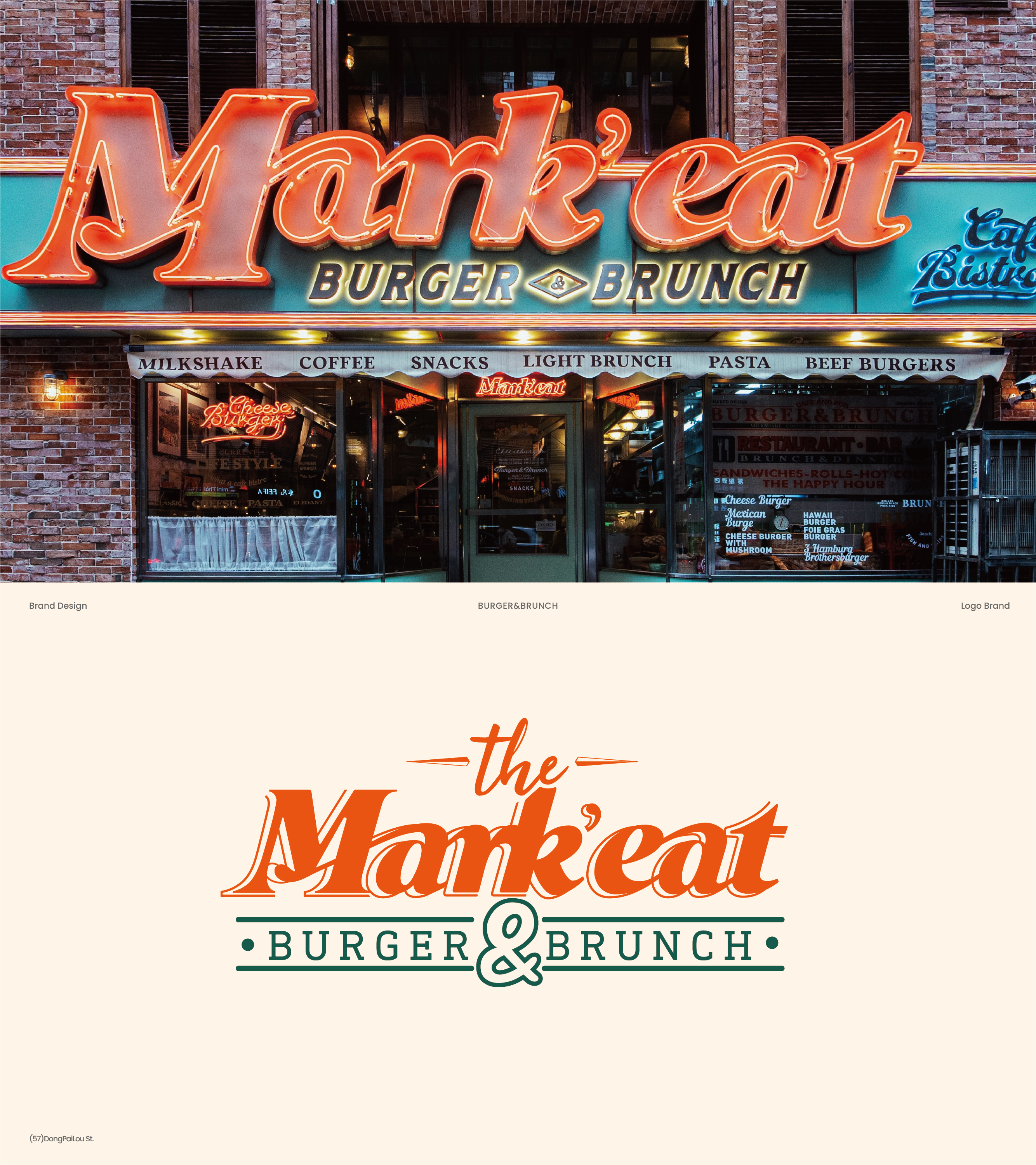
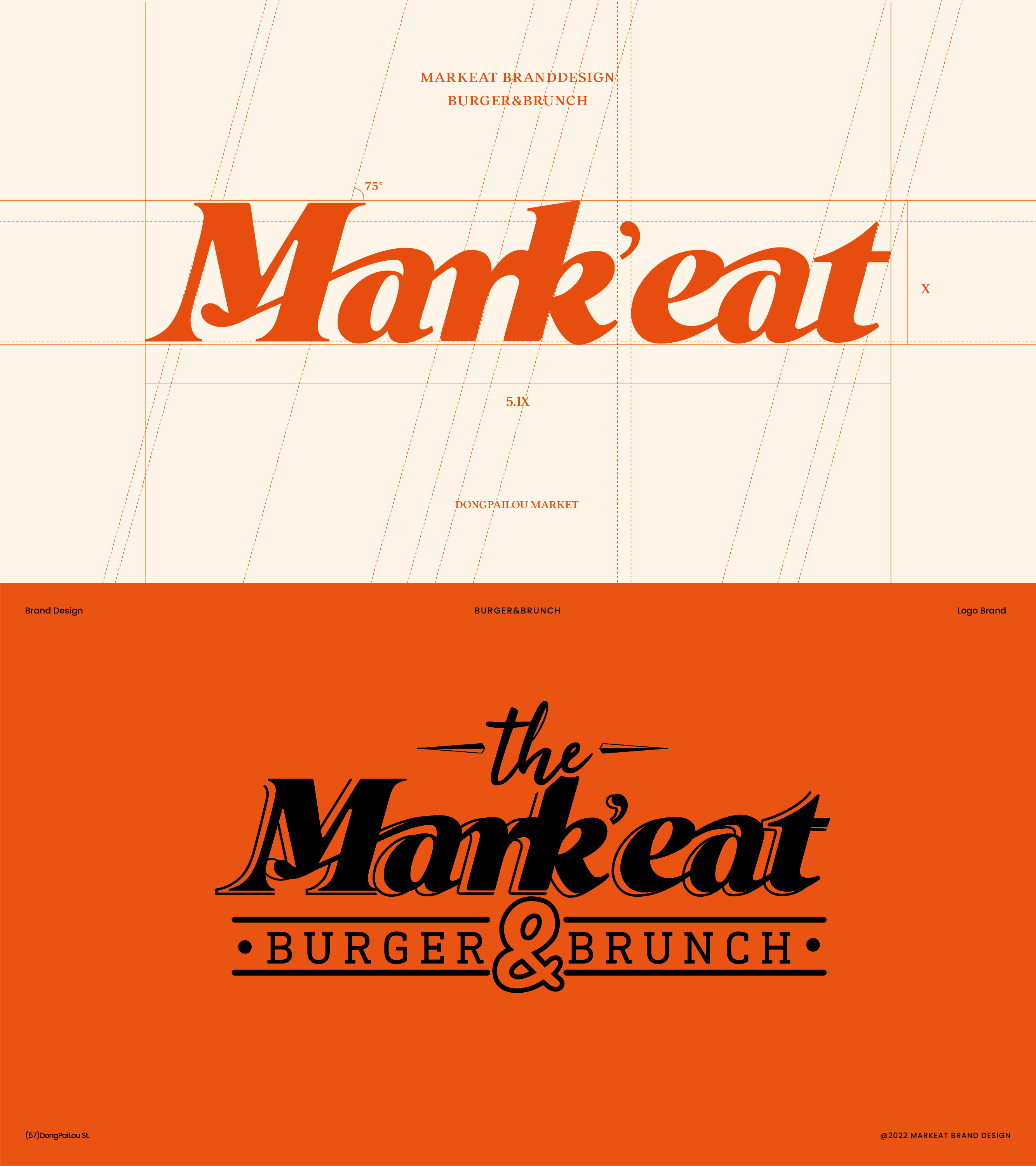
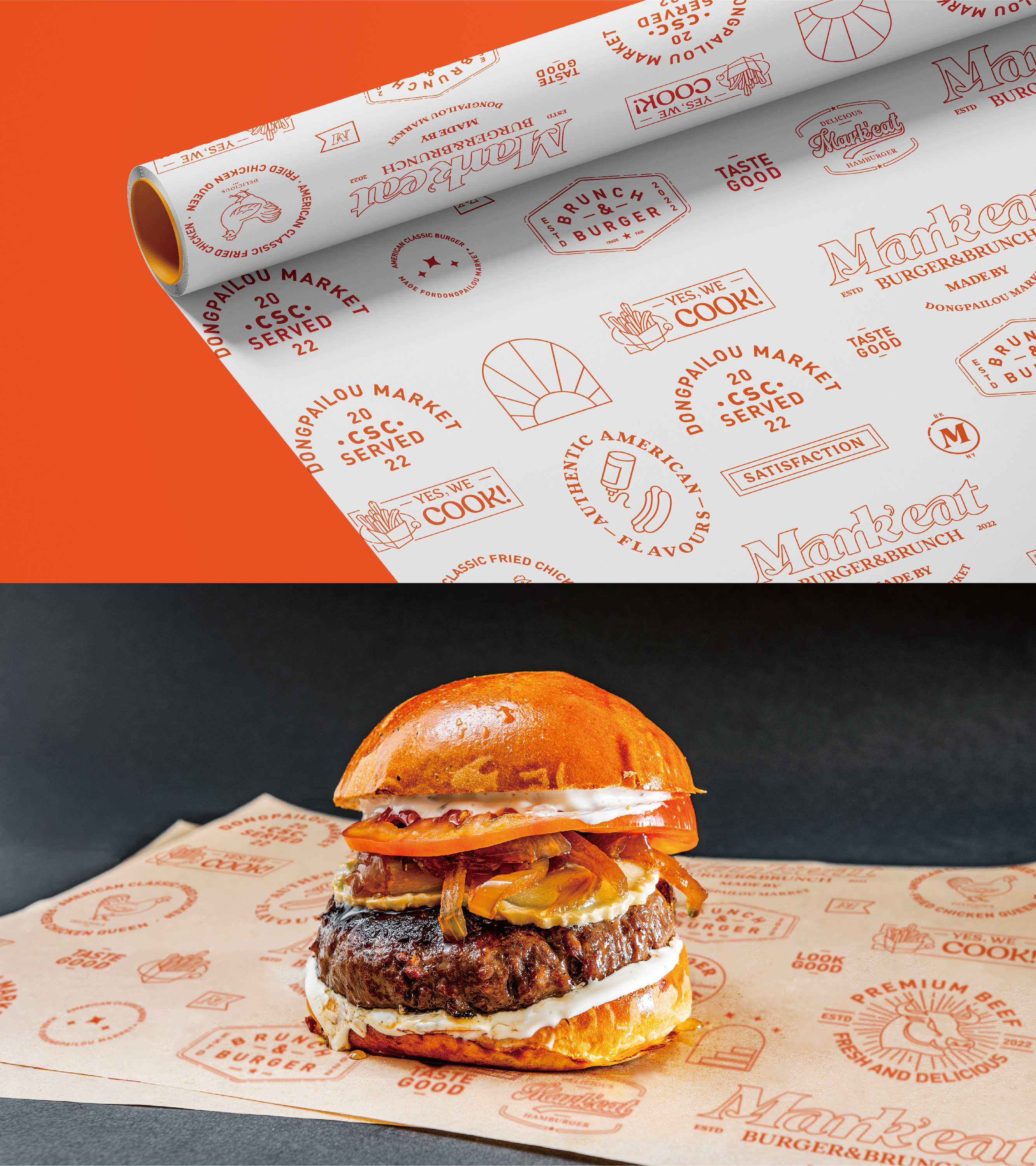
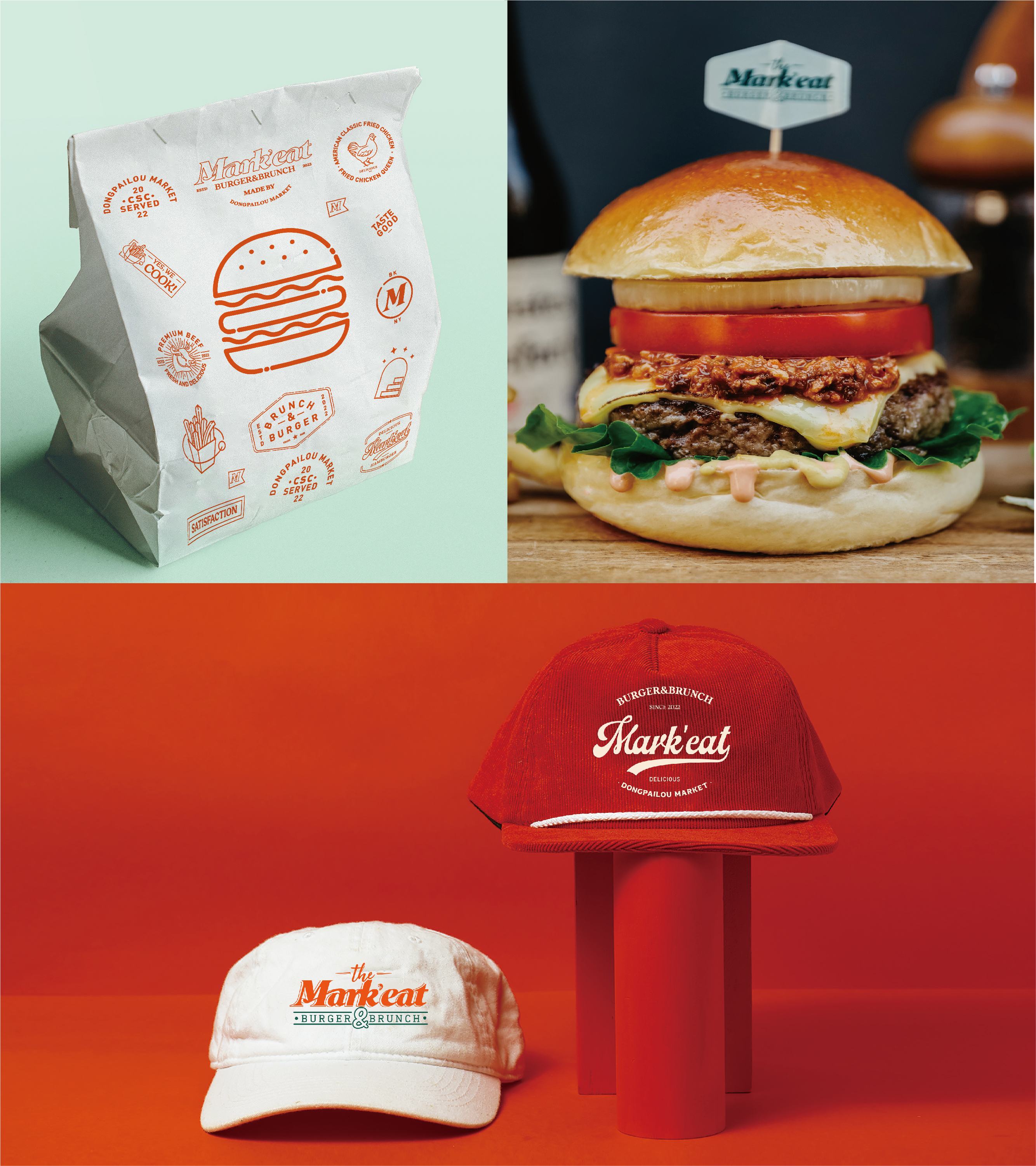
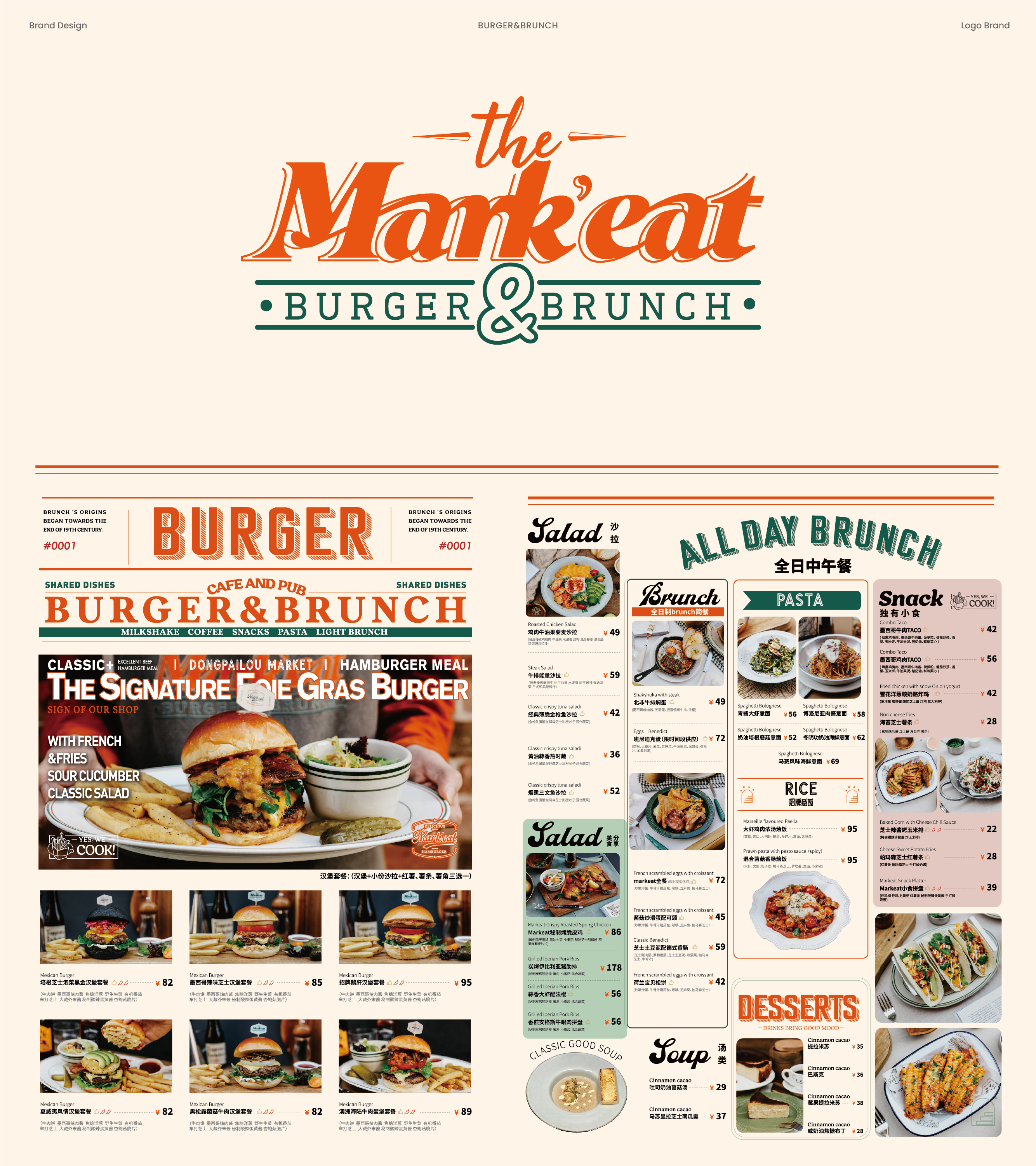
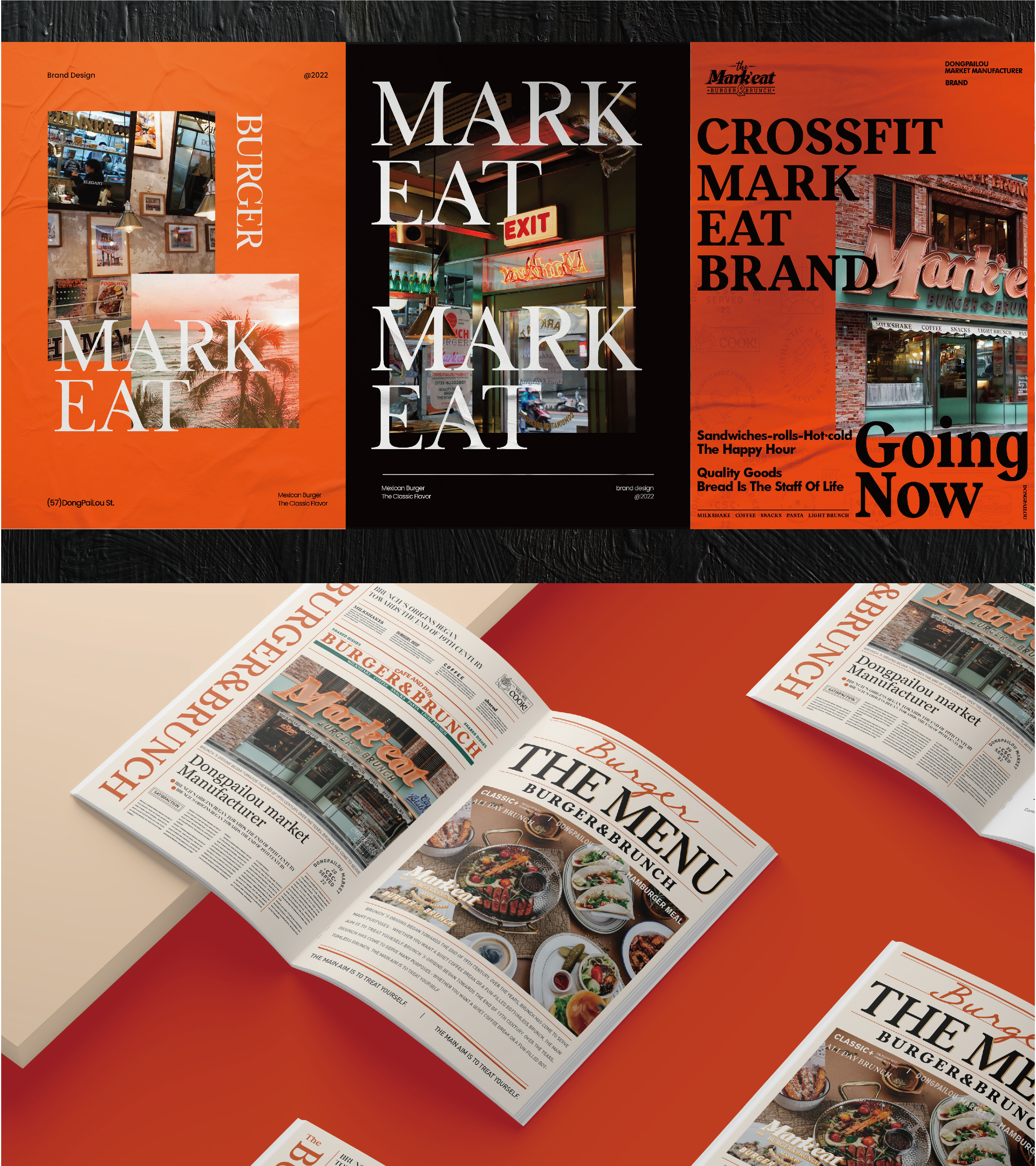
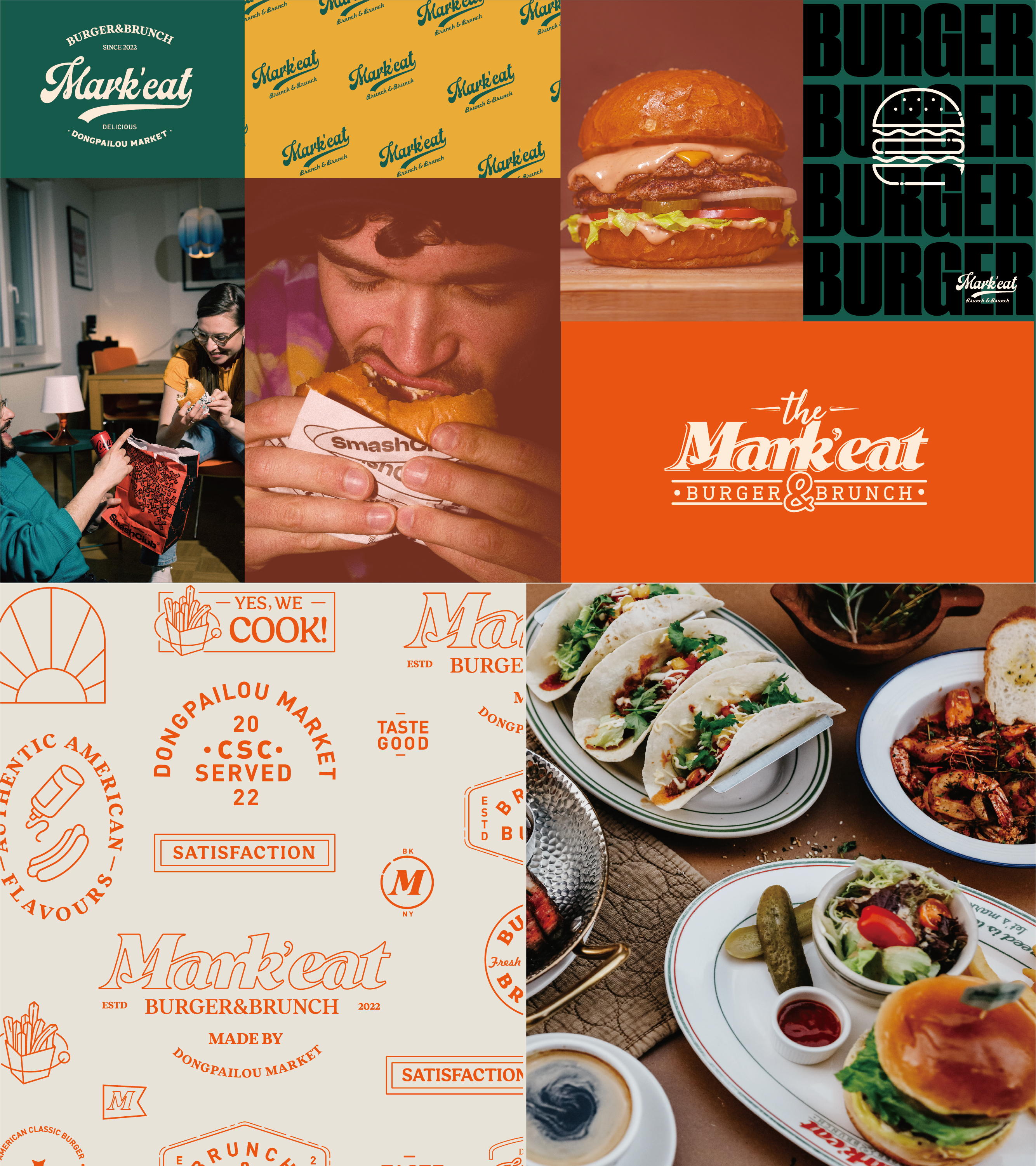
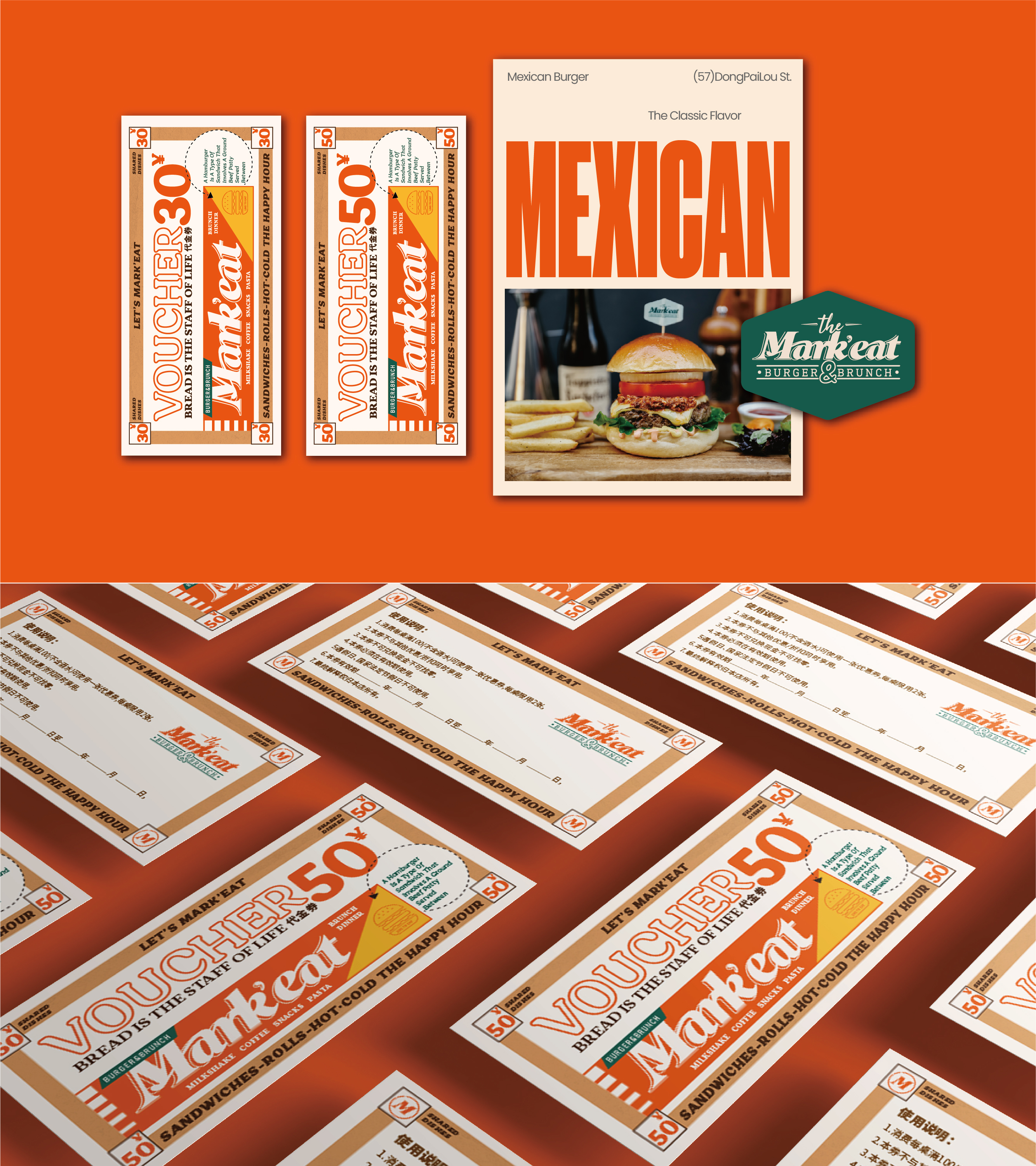
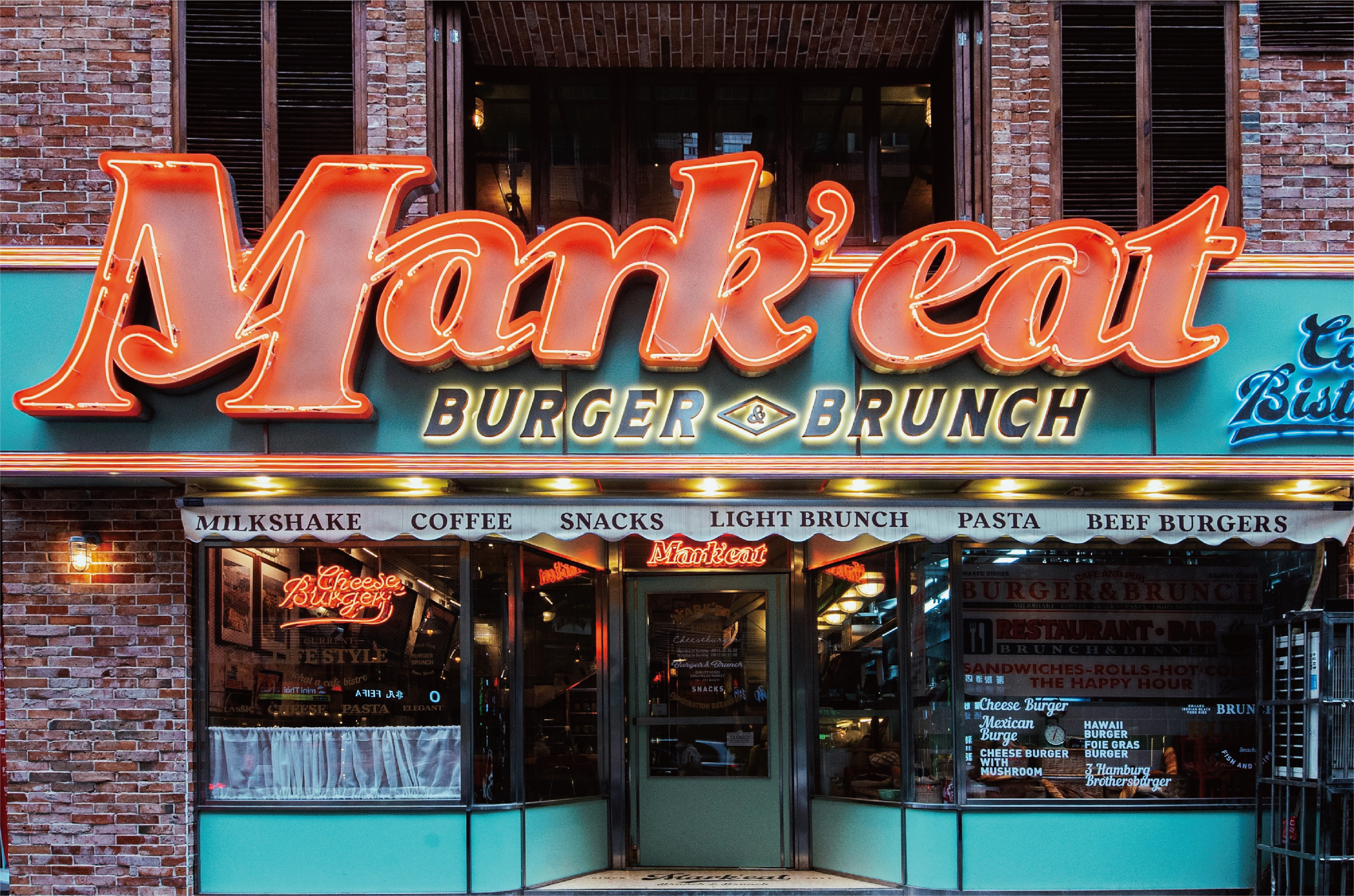
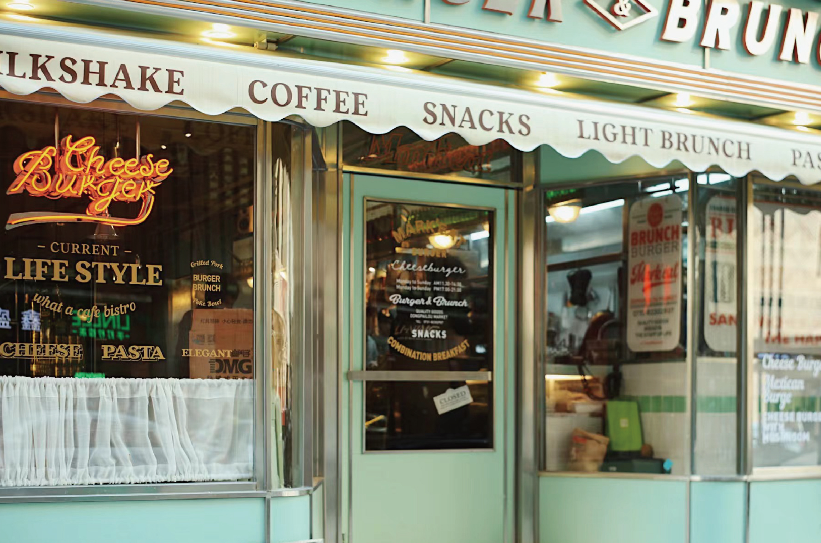
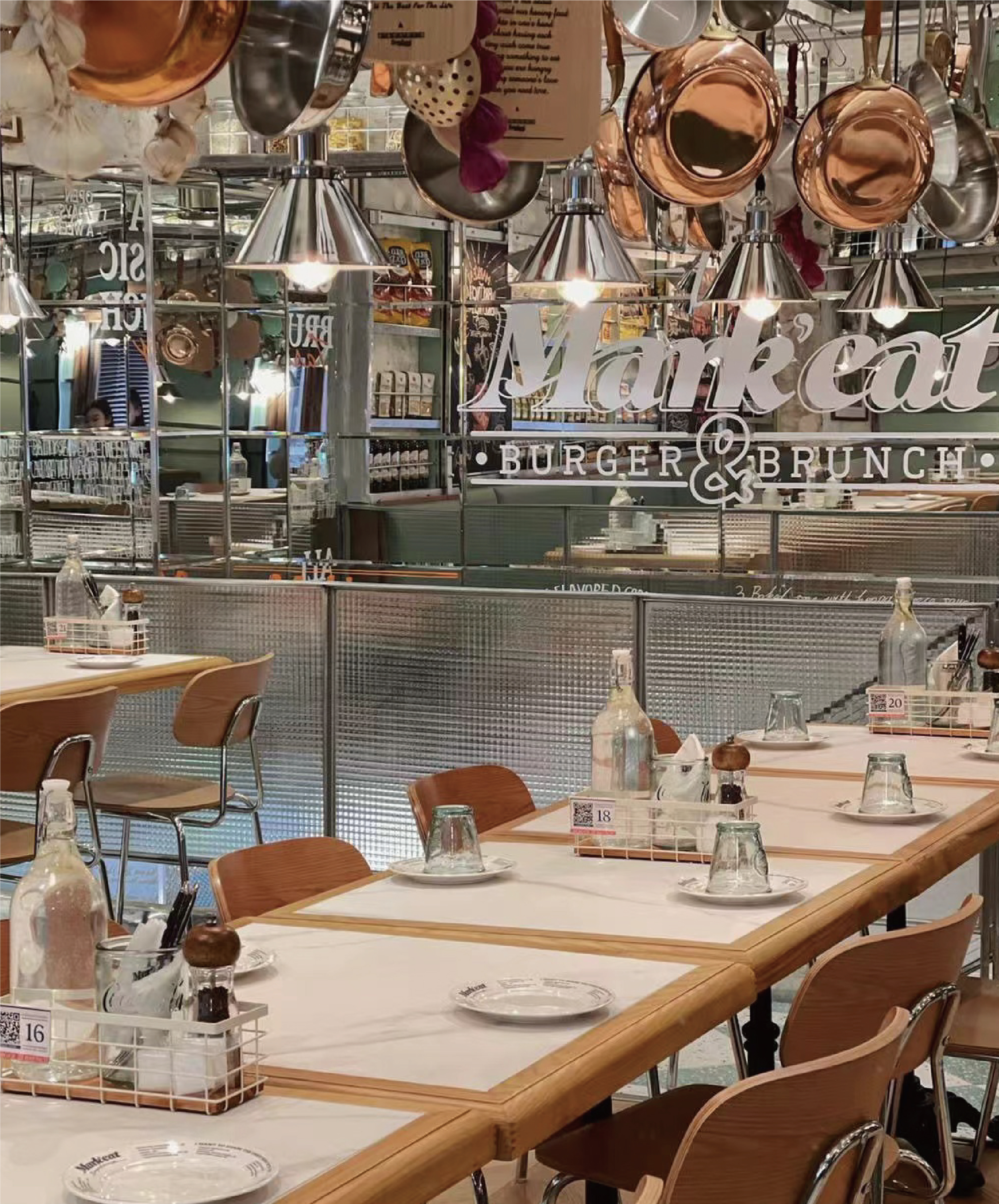
品牌创意是把markeat的西文字体融合衬线体+手写体,让文字图形化图形灵感来源于品牌本身的内涵及美式街头文化
颜色选择上沿用汉堡本身的颜色认知,橙色+青绿色,绿色不同于普通常见的绿色,这个绿色更显品质和轻奢感觉,排版上采用美式独特构成方式,采用美式电影&美式杂志的手法来诠释品牌的调性和风格!
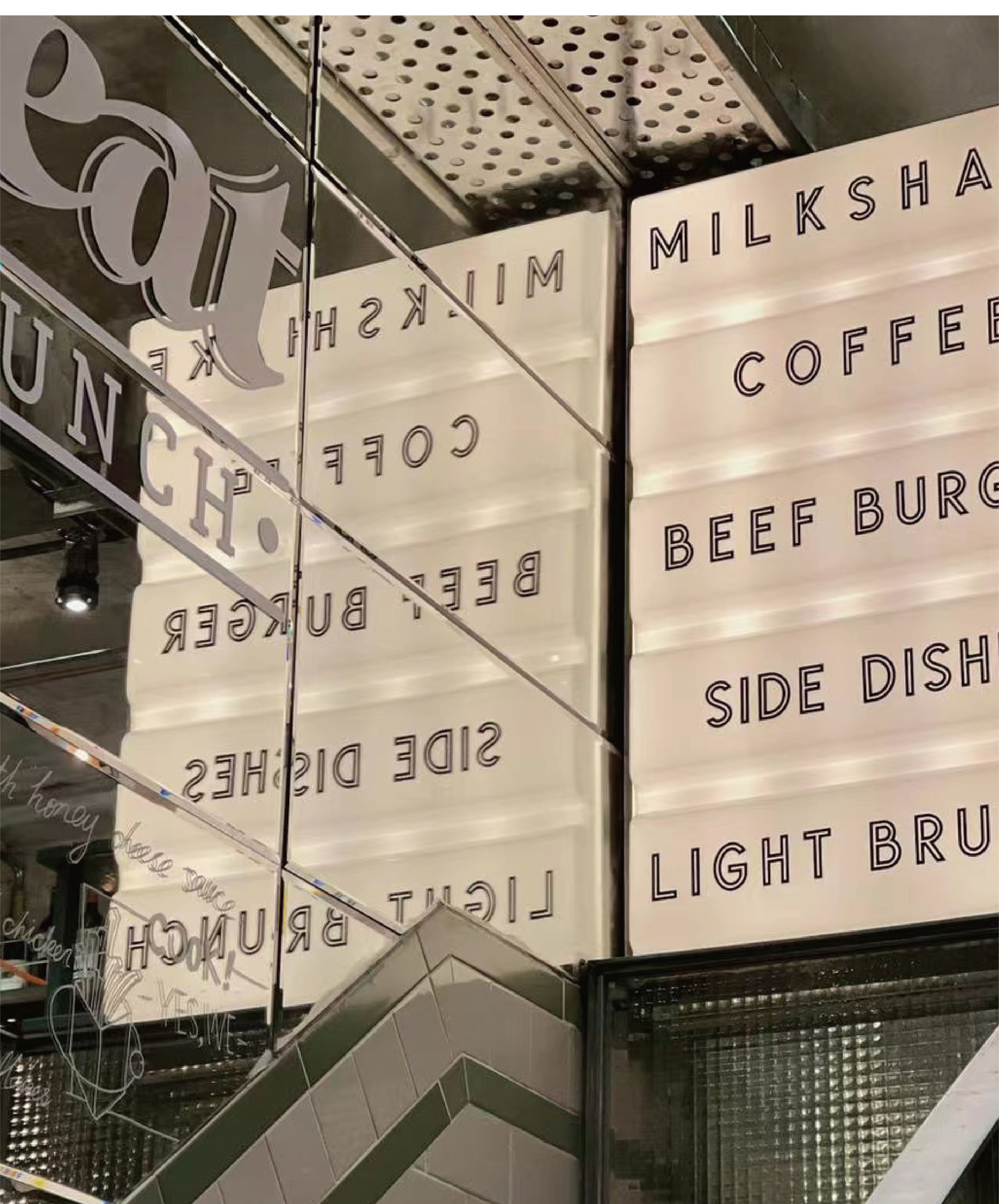
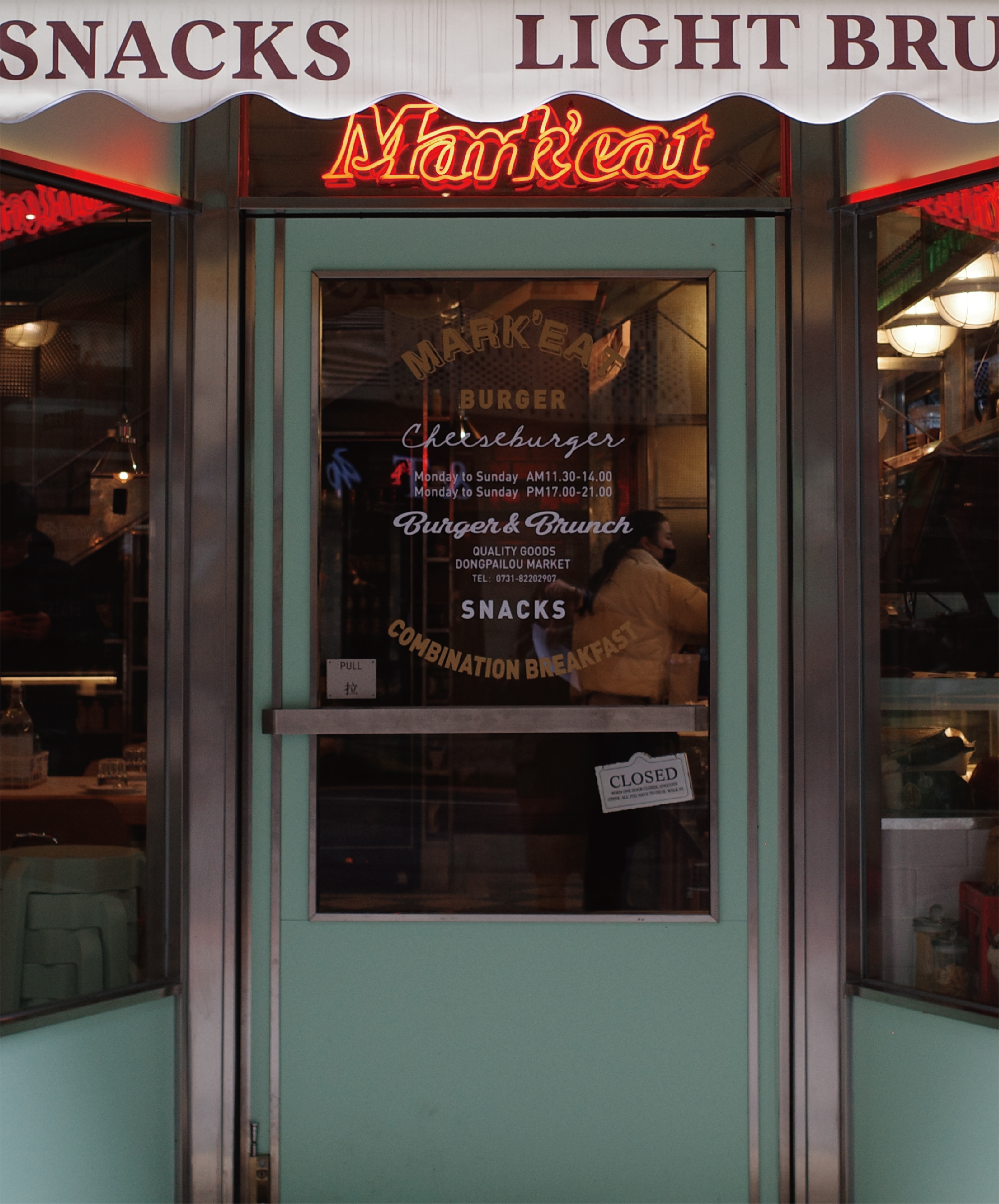
mark’s eat is an American retro Western restaurant located in Changsha, which includes all kinds of food, including burger and brunch
The brand idea is to integrate markeat’s Western fonts with serif and handwriting, so that the graphic inspiration of the text comes from the connotation of the brand itself and American street culture
The color selection follows the color cognition of the burger itself, orange + cyan green. Green is different from the common green, which shows more quality and light luxury feeling. In the typography, the unique composition of the American style is adopted, and the tonality and style of the brand are interpreted by the way of American movies and American magazines!
–
项目丨PROJECT
mark’eat餐饮品牌全案设计
–
服务丨SERVICE
品牌策划/LOGO设计/VIS设计/空间文化植入
–
团队丨TEAM
honyee.design&studio
–
品牌设计BRAND DESIGN:Honyee泓
空间设计SPACE DESIGN:皆大欢喜
#注:禁止无授权转载|商业使用|商业演释