

KLINIK ESTETIKA
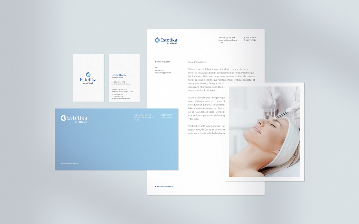
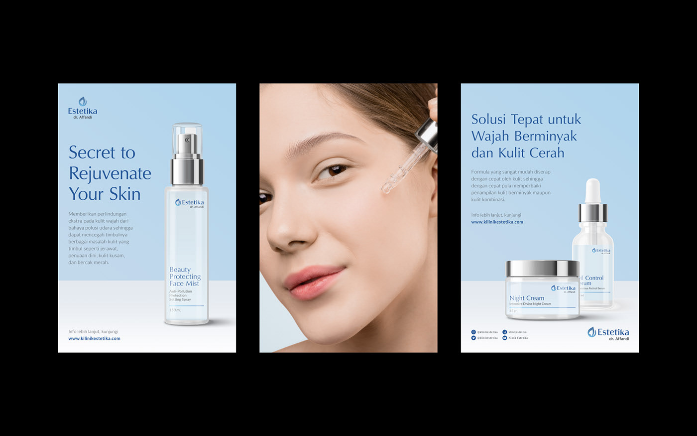
A visual identity rejuvenation for Klinik Estetika. We work along with the Mark Plus team helps Klinik Estetika to strengthen their voice and capture their personality through a refreshed identity.
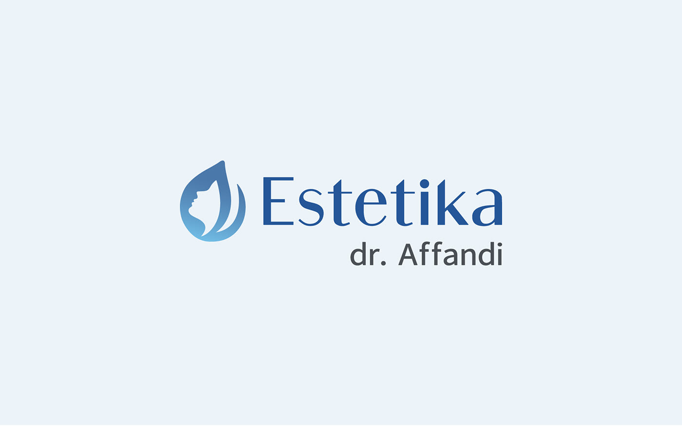
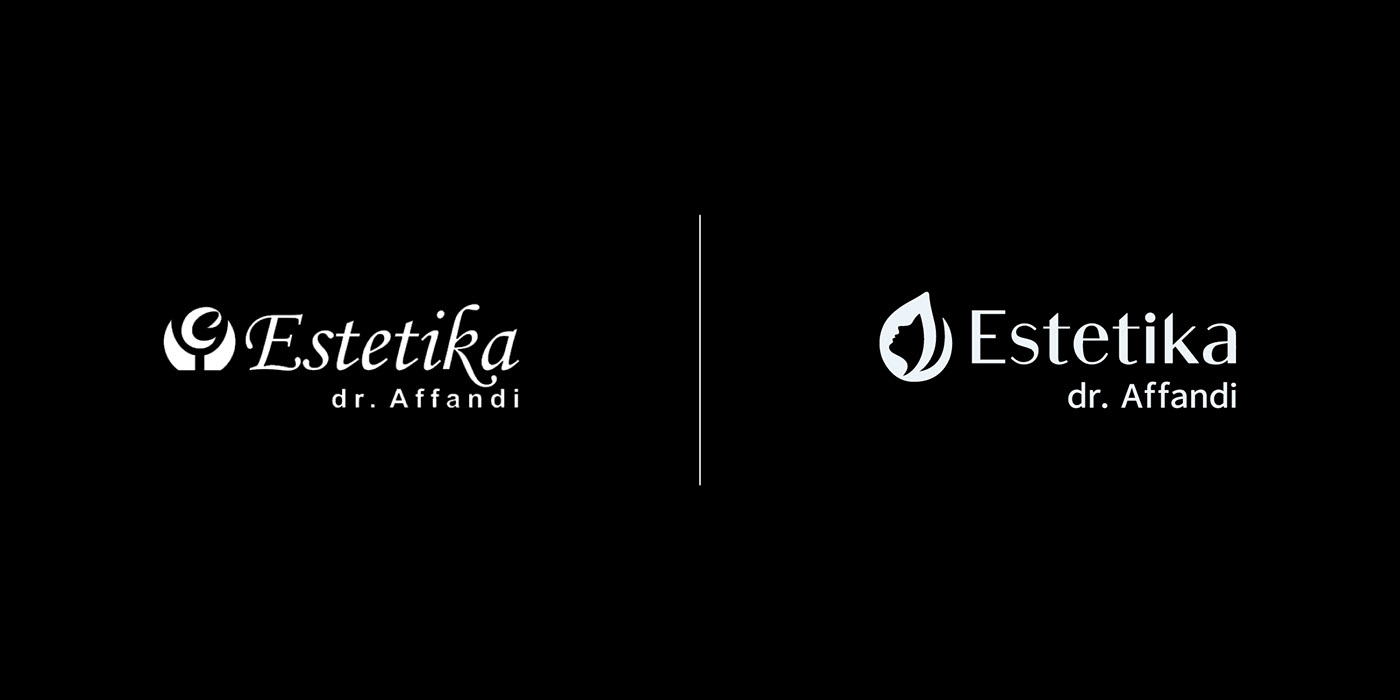
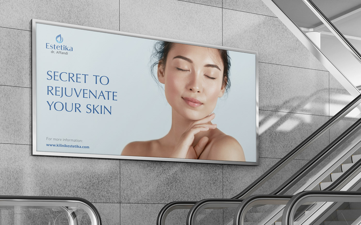
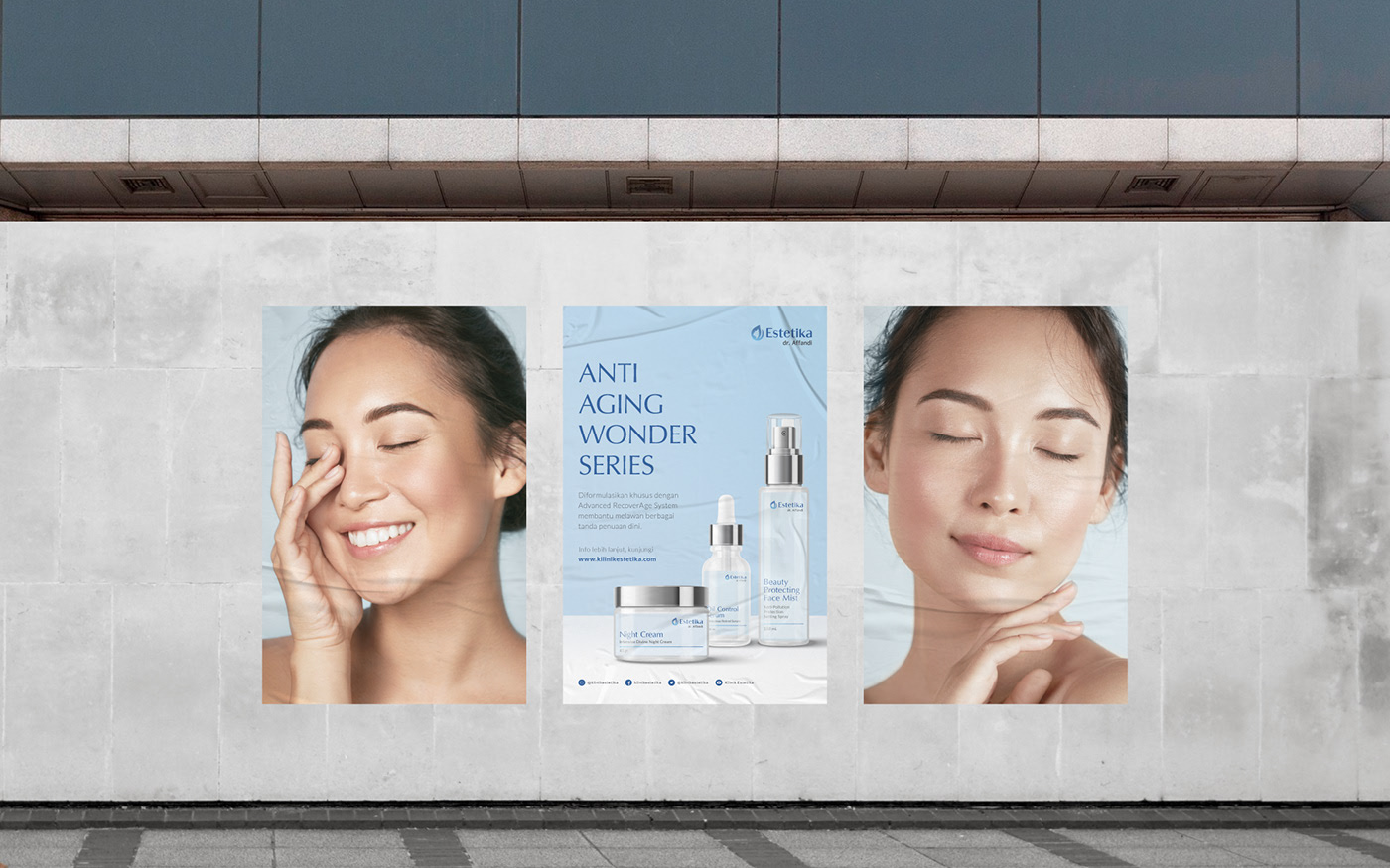
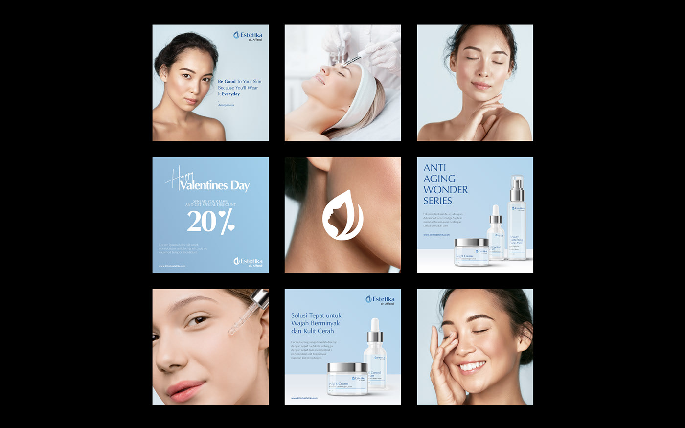
Inspired by the previous logo with tweaks and modern implementation, a combination of a tulip flower, the letter “e” and adding a female face will create a more soft and feminine approach to the logogram.
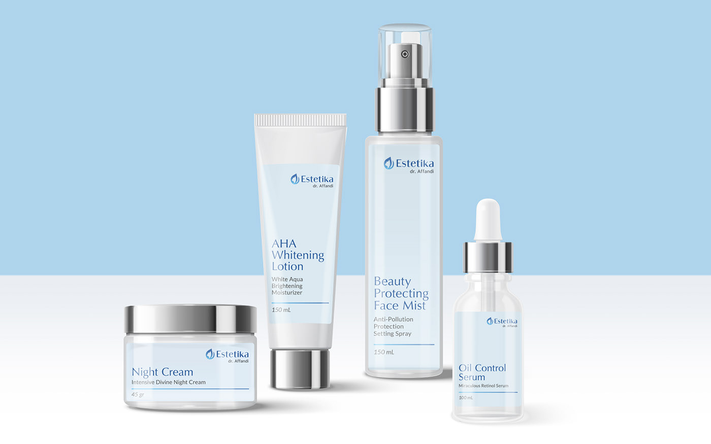
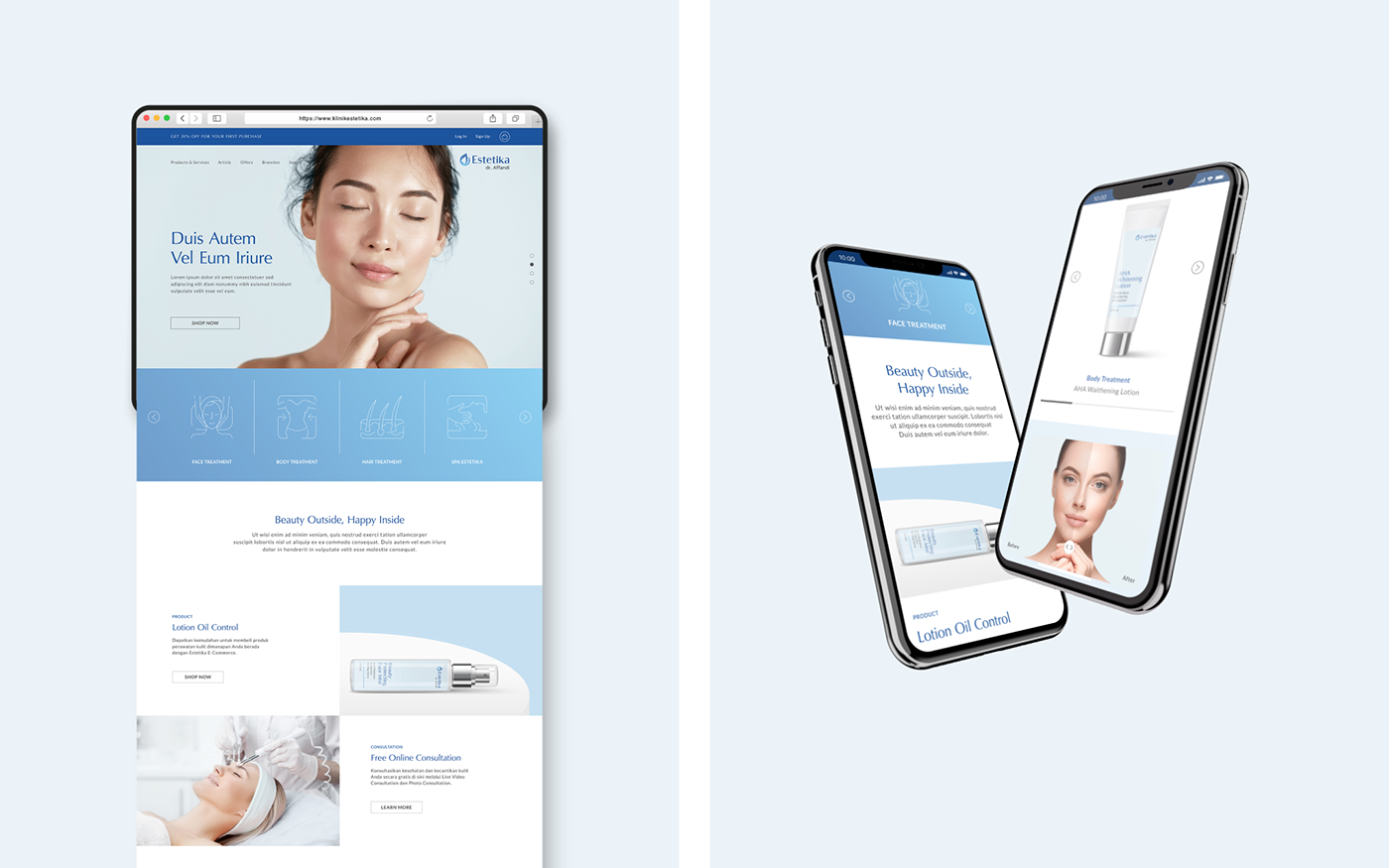
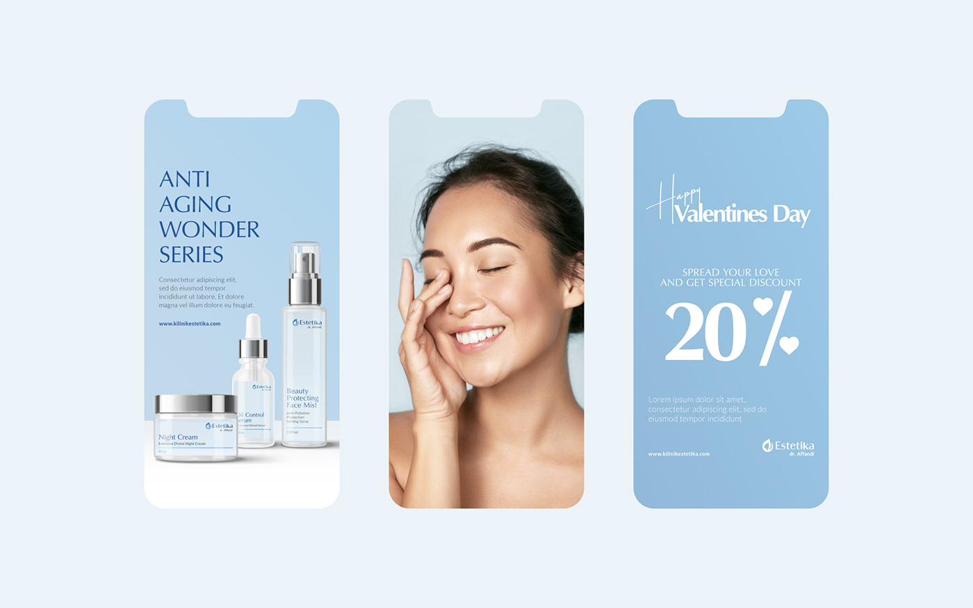
With modern yet classic typography, a sense of maturity is given to the overall branding, pairing it with combination of blue colors that portray calm and loyalty, will initiate a comfortable and trustworthy environment toward the customer.
DISCIPLINES:
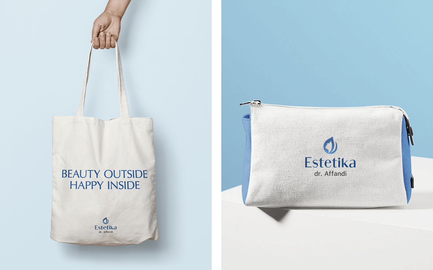
Brand Identity, Graphic Design,
Packaging, Social Media

https://www.behance.net/gallery/104982257/Klinik-Estetika-Re-Branding?tracking_source=project_owner_other_projects